Washington state ferries
Concept
The Washington State Ferries (WSF) is a utilitarian, government run service used by everyone. The goal is to refresh the WSF brand. Commuters and tourists need a reminder that they can count on the ferries to not only get them where they want to go, but evolve with the times. An additional level of brand cohesion is needed to prove this point.
Challenge
Develop a new visual identity that is both relatable and trusted for a well known government public transportation service.
One Sentence Message:
WSF is more than transportation, it’s the Northwest experience.
Brand Character:
Efficient, trusted, and connected.
Brand Purpose:
As the largest ferry system in the U.S., WSF sets the standard for transporting people where they need to go comfortably and safely throughout the Washington’s waterways
Solution
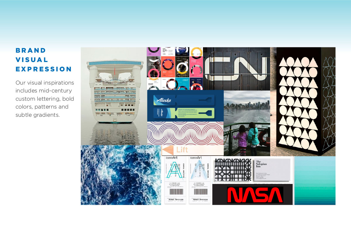
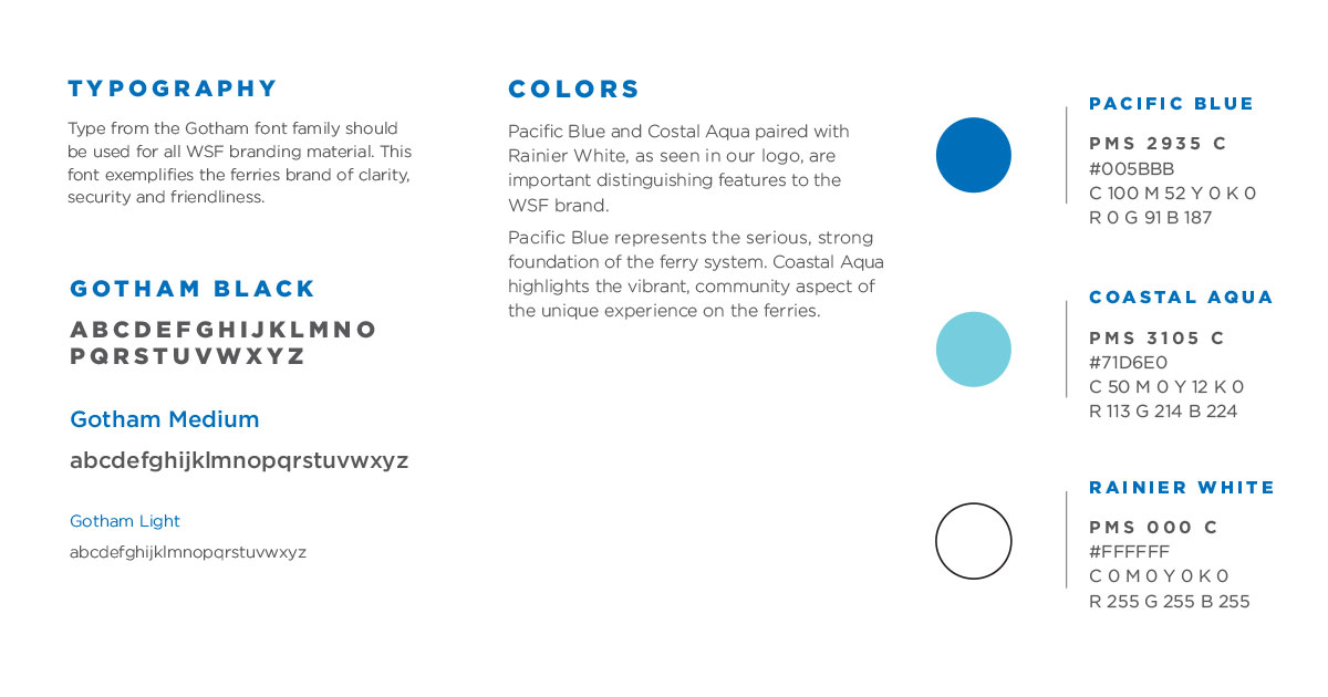
A modern, illustrative brand mark that connects riders to the experience of riding the ferry This is paired with strong and clear custom lettering. Gotham was used for it’s round, friendly letter form. A limited color palette, gradients, and pattern are used to create a clean aesthetic.
Timeframe: 12 Weeks
My Role:
Concept
Branding
Merchandise
Visual Design
Mobile and Web Design
Environmental Graphics
Collaborator:
Lauren March
Tools: InDesign, Illustrator, Photoshop, Sketch
Deliverables: Research, Branding, Logo, Brand Identity Book, Print & Web Ads, Merchandise, App, Website Home, Environmental Graphics
Washington State Ferries Logo
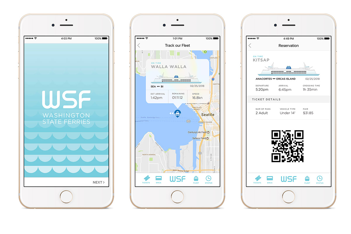
Website and App
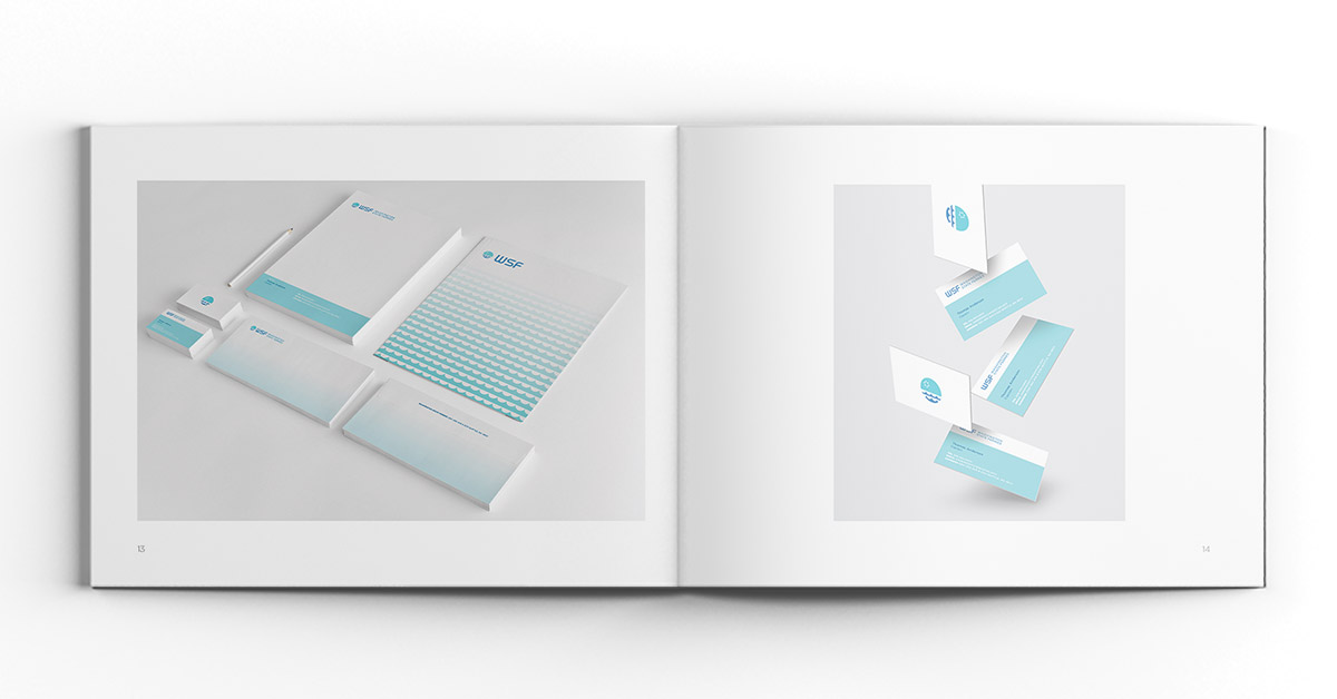
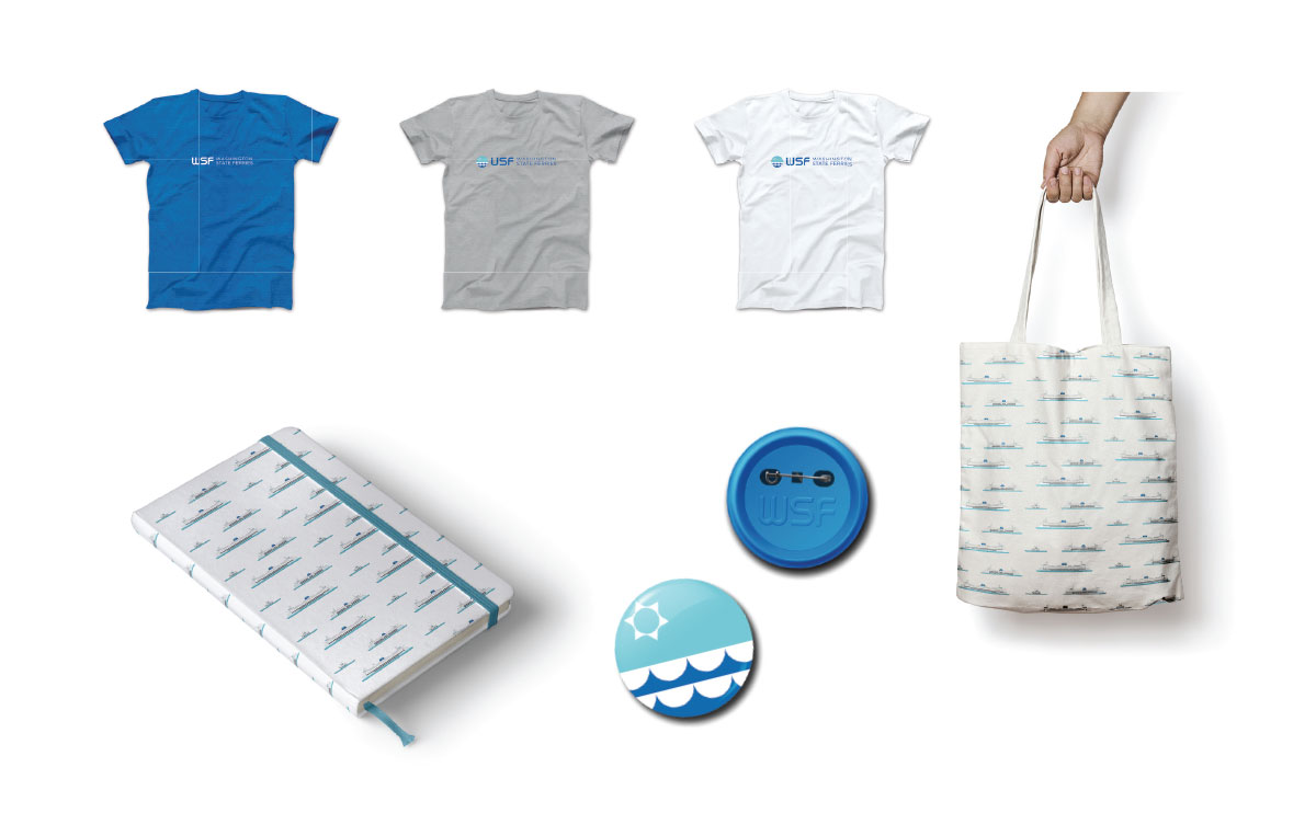
Merchandise
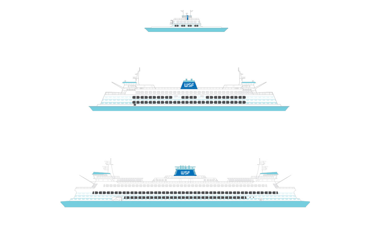
Environmental Graphics
